
23 Kitchen Rule of 3 Ideas for a Stylish Space
1. Three Pendant Lights Over the Island
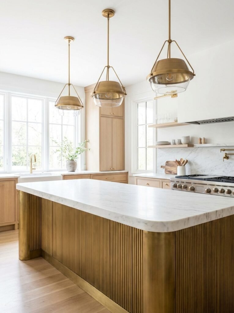
Hanging three pendant lights above a kitchen island is one of the most reliable ways to apply the rule of three in a functional, eye-catching way. The repetition of identical fixtures creates rhythm and symmetry, drawing the eye along the length of the island while providing balanced task lighting for cooking and gathering.
Choosing the right spacing matters just as much as the fixtures themselves. Pendants are typically hung with even gaps between them, centered above the island’s length, so the arrangement feels intentional rather than accidental. Matching finishes, whether brass, matte black, or glass, reinforces cohesion and keeps the trio reading as one unified design statement.
This lighting choice works in nearly any kitchen style, from farmhouse to contemporary. Swapping pendant shapes, such as globe, dome, or linear cage designs, allows the same rule-of-three principle to suit different aesthics. Ultimately, three pendants strike the perfect balance between visual interest and simplicity, avoiding the clutter of too many fixtures.
2. Trio of Canisters on the Counter
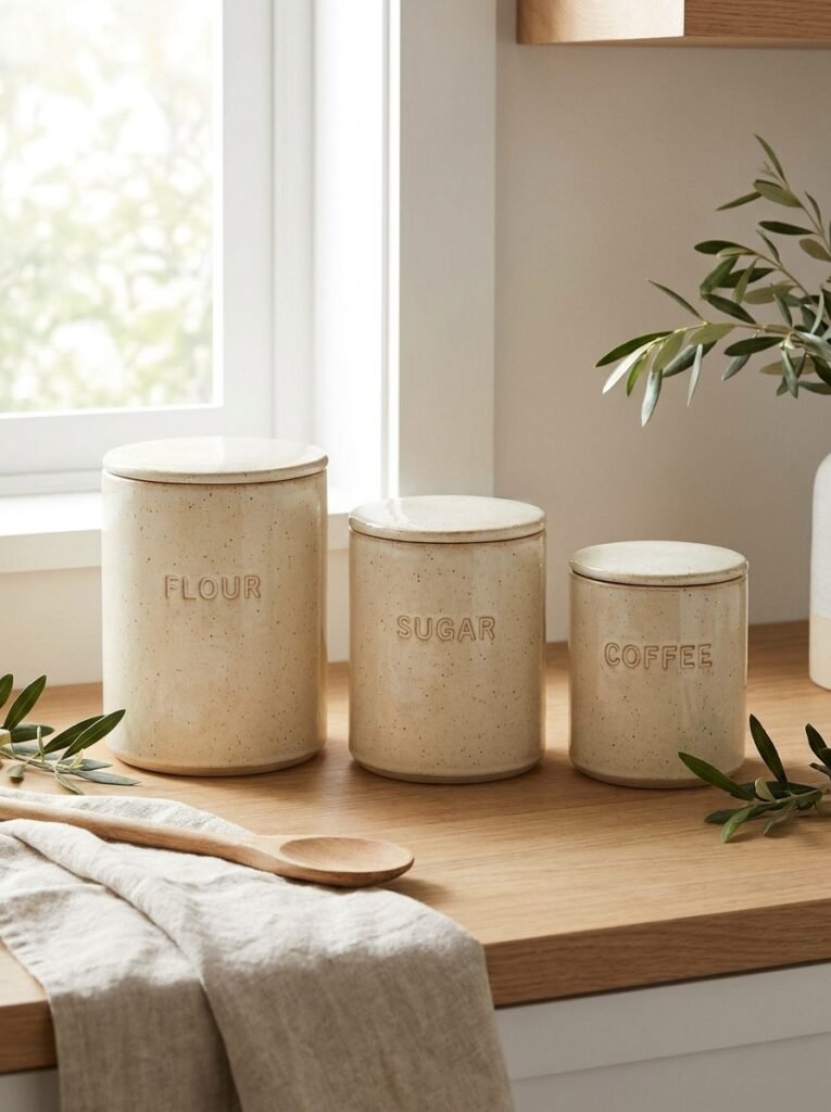
A trio of matching canisters brings order and charm to an open kitchen counter while keeping everyday staples like flour, sugar, and coffee within easy reach. Grouping exactly three containers, rather than a cluttered collection, keeps the counter looking curated and intentional, turning a purely functional item into a decorative styling moment.
Graduating the canisters in size adds visual interest and guides the eye naturally across the grouping. Choosing a cohesive material and color palette, such as matte cream ceramic or brushed stainless steel, ensures the set feels like one cohesive unit rather than mismatched containers. Simple, legible labels add a touch of charm without overwhelming the display.
Placement matters as much as the canisters themselves. Positioning the trio near the coffee station or baking area keeps them practical, while leaving surrounding counter space clear prevents visual overload. This small styling choice proves that even the most functional kitchen items can contribute meaningfully to a stylish, organized aesthetic.
3. Three-Tier Fruit Stand Display
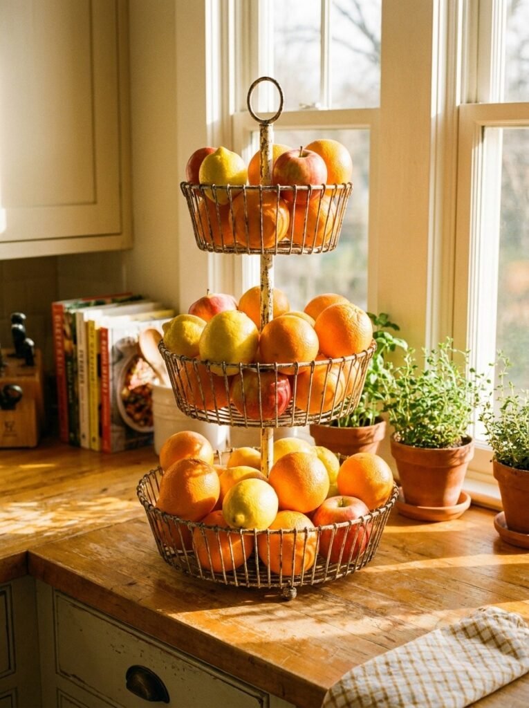
A three-tier fruit stand solves the eternal kitchen challenge of fruit clutter while doubling as an eye-catching decorative feature. Stacking fruit vertically across three tiers keeps counter space free and creates a natural focal point full of color and texture. This single piece effortlessly blends function with style, making produce storage feel intentional rather than incidental.
Filling each tier with a different fruit variety enhances the visual rhythm the rule of three is known for. Bright citrus on one level, apples on another, and perhaps bananas on the top tier create color variation that feels lively without being chaotic. Choosing a stand in wire, wood, or marble allows this piece to match nearly any kitchen style.
Beyond aesthetics, this display encourages healthier eating habits by keeping fresh produce visible and accessible rather than hidden in drawers or the refrigerator. Positioned near the sink or on an island, the stand becomes both a practical storage solution and a charming still-life arrangement that changes subtly with each grocery trip.
4. Triple Cutting Board Lean Display
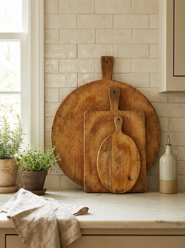
Leaning three cutting boards of varying sizes against a backsplash or open shelf is a favorite styling trick among kitchen designers, turning everyday tools into an intentional design feature. This casual arrangement adds warmth and texture, particularly in farmhouse or rustic kitchens, while keeping frequently used boards visible and within easy reach.
Choosing boards in slightly different sizes and wood tones, such as walnut, maple, and oak, creates natural variation that feels organic rather than staged. Layering them front to back, largest to smallest, mimics the graduated visual effect central to good rule-of-three styling, giving the display depth and dimension against the flat backdrop.
This idea works particularly well near a prep station or stove, where the boards remain functional as well as decorative. Pairing the display with a small potted herb or a ceramic utensil holder nearby rounds out the vignette. It’s an effortless way to add texture and warmth without introducing any purely ornamental clutter.
5. Three Matching Bar Stools at the Island
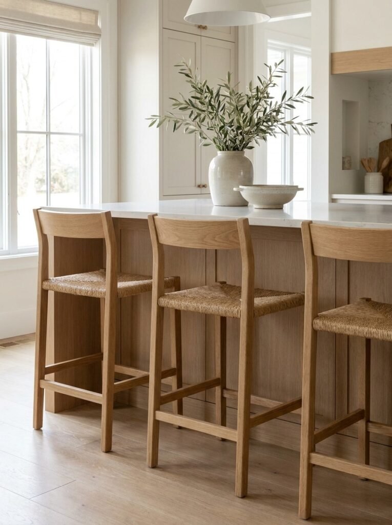
Seating three matching bar stools at a kitchen island creates a balanced, symmetrical focal point that anchors the entire space. Odd numbers, particularly three, tend to feel more visually dynamic than even pairings, making this a popular choice for islands of standard length. The repetition of identical stools reinforces cohesion throughout the kitchen.
Selecting stools with a comfortable seat height and a material that complements the surrounding cabinetry and countertops ties the seating area into the broader design scheme. Woven rattan, matte black metal, or warm wood tones each bring a different mood, but keeping all three stools identical is key to maintaining the clean, intentional rule-of-three effect.
Spacing the stools evenly along the island, typically with about six inches between each seat, ensures comfortable seating for multiple people. This arrangement not only looks polished in photographs but also functions well for everyday family meals or casual entertaining, proving that practical seating choices can double as strong style statements.
6. Trio of Potted Herbs on the Windowsill
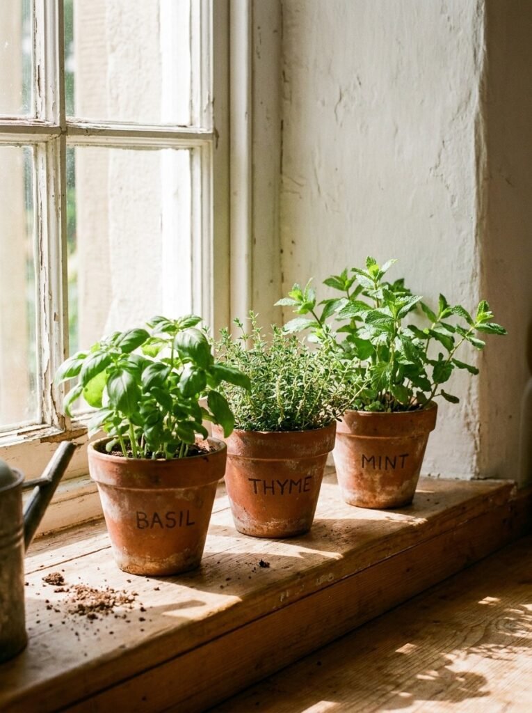
A trio of potted herbs on a sunny windowsill combines practicality with the calming, natural charm of greenery. Growing three complementary herbs, such as basil, thyme, and mint, provides fresh ingredients for cooking while adding a pop of green life to an otherwise hard-surfaced kitchen. This small vignette feels both purposeful and beautifully simple.
Using matching terracotta or ceramic pots for all three herbs reinforces the cohesive, curated look central to rule-of-three styling. Varying the herb heights slightly, or staggering the pots front to back, adds subtle dimension to the display. A small chalkboard label or simple twine tag on each pot adds a charming, personal touch.
Positioning this herb trio directly on a windowsill ensures the plants receive adequate sunlight to thrive, keeping the display looking fresh rather than wilted. Snipping herbs regularly for cooking also keeps this arrangement functional and ever-changing, making it one of the most rewarding and low-maintenance styling choices for a kitchen space.
7. Three Open Shelves Styled with Objects
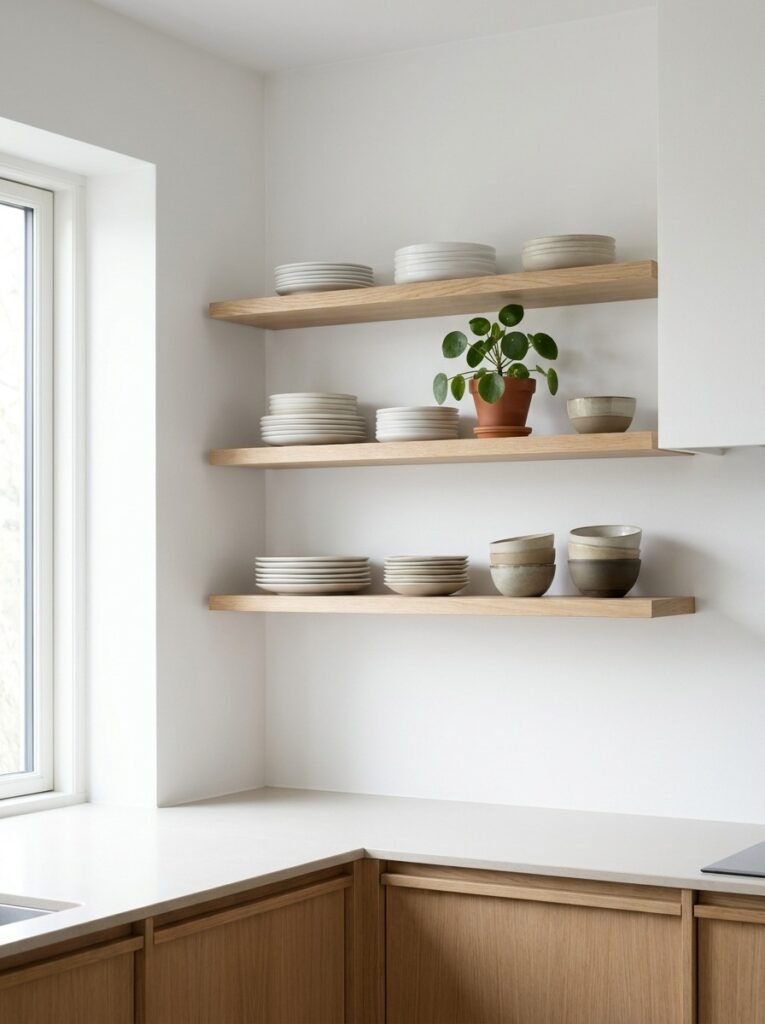
Open shelving styled in groups of three objects per shelf creates a curated, boutique-like feel that avoids the visual chaos often associated with open storage. Rather than filling shelves edge to edge, leaving breathing room around three carefully chosen items per shelf allows each piece to stand out while maintaining an overall sense of calm and order.
A well-styled shelf typically balances height, texture, and color across its three objects. For example, a stack of plates, a small potted plant, and a ceramic bowl create variation in shape and material while remaining visually connected through a shared neutral palette. This approach transforms functional storage into an intentional design display.
Rotating the objects seasonally or as needed keeps the shelves feeling fresh and prevents the space from feeling static. The key to success with open shelving lies in restraint: resisting the urge to overfill each shelf ensures the rule-of-three principle remains visible, giving the kitchen a polished, magazine-worthy appearance with minimal effort.
8. Triple Glass Jar Pantry Display
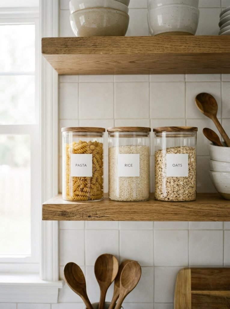
Displaying pantry staples in three matching glass jars turns everyday storage into an organized, visually satisfying feature. Grouping dry goods like pasta, rice, and oats into identical clear containers not only keeps the pantry tidy but also allows the natural colors and textures of the food itself to contribute to the kitchen’s overall aesthetic.
Uniformity is essential to this idea’s success. Choosing jars of the same shape, size, and lid style ensures the trio reads as a cohesive set rather than mismatched storage. Arranging them in a straight row, ideally at eye level on an open shelf or countertop, maximizes both visual impact and everyday accessibility while cooking.
Simple handwritten or printed labels add a polished, boutique-pantry feel to the display without requiring elaborate design work. This styling trick works particularly well in kitchens with limited cabinet space, transforming necessary storage into an attractive feature. It’s a small investment of effort that yields a noticeably more organized, stylish kitchen.
9. Three Framed Art Prints on the Wall
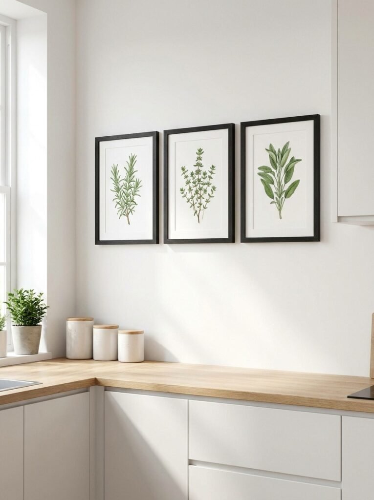
Hanging three matching framed prints in a row introduces personality and artistic interest into a kitchen without overwhelming the space. This gallery-style arrangement, whether featuring botanical illustrations, abstract art, or vintage recipe cards, adds a layer of visual sophistication typically reserved for living rooms or hallways, elevating the kitchen’s overall design.
Consistency in framing is crucial for this idea to succeed. Choosing identical frame colors and sizes, even if the artwork inside varies slightly in subject, keeps the arrangement feeling curated and intentional. Even spacing between each frame, typically two to three inches apart, maintains the clean, rhythmic quality central to good rule-of-three design.
This wall display works particularly well above a breakfast nook, a stretch of empty wall near the table, or above open shelving. It offers an easy way to introduce color, pattern, or personal style into a kitchen that might otherwise rely solely on cabinetry and countertops for visual interest and character.
10. Trio of Ceramic Vases
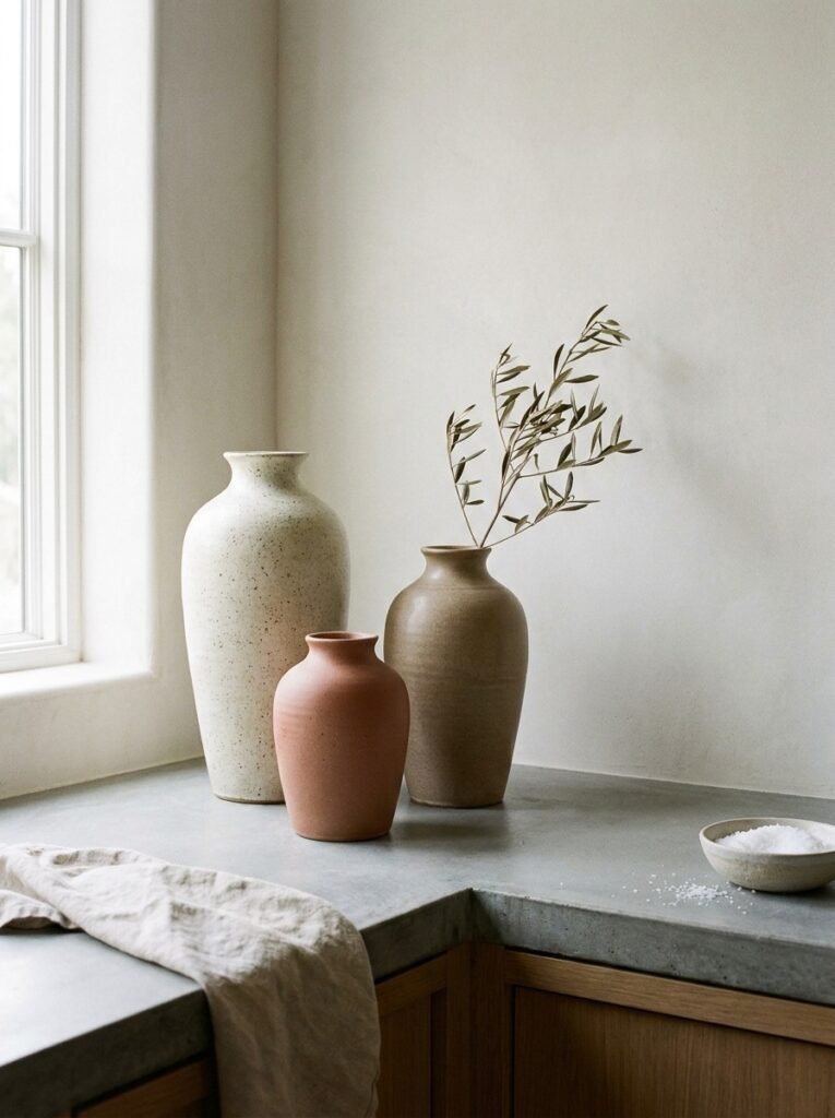
A trio of ceramic vases in varying heights creates an elegant, sculptural moment on any kitchen counter or open shelf. Even without flowers, the vases themselves offer enough textural and visual interest to serve as a standalone decorative feature, making this one of the simplest ways to apply rule-of-three styling to a kitchen.
Selecting vases in a cohesive color family, such as warm terracotta, soft sage, or matte white, while varying their shapes and heights slightly, creates the graduated visual rhythm this design principle relies on. Mixing matte and glossy finishes within the trio adds subtle depth without introducing competing colors or breaking the sense of cohesion.
Adding a few stems of dried flowers, eucalyptus, or pampas grass to just one or two of the vases introduces organic texture while keeping the arrangement from feeling too uniform. This flexible display can be easily refreshed seasonally, making it a versatile styling choice that adapts effortlessly to changing tastes.
11. Three-Piece Cookware Display
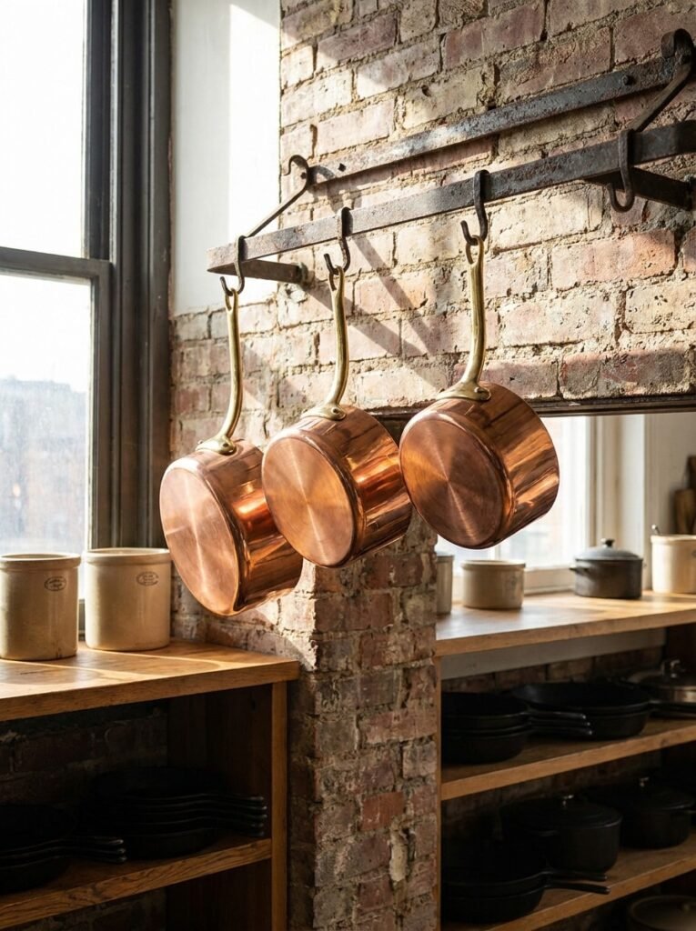
Displaying three matching pieces of cookware, such as copper saucepans or cast iron skillets, on a wall-mounted rack transforms functional kitchen tools into an intentional decorative feature. This approach works particularly well in kitchens with limited cabinet space, freeing up storage while adding warmth and texture to an otherwise plain wall.
Choosing cookware in a matching material and finish, whether polished copper, matte black cast iron, or brushed stainless steel, ensures the trio reads as a cohesive design element rather than random kitchen clutter. Arranging the pieces by graduating size, from largest to smallest, reinforces the visual rhythm central to effective rule-of-three styling.
Positioning this display near the stove keeps the cookware genuinely functional, allowing pieces to be lifted down and used regularly rather than serving purely decorative purposes. The slight wear and patina that develops with regular use only adds to the display’s authentic, lived-in charm over time, deepening its visual character.
12. Triple Woven Basket Storage
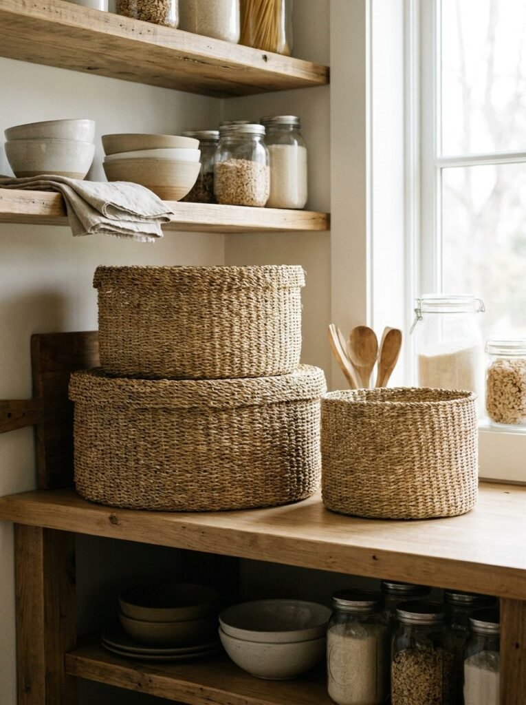
Three matching woven baskets offer a practical yet stylish storage solution for kitchen items that don’t need to be visible, such as linens, snacks, or produce. The natural texture of seagrass or rattan baskets introduces warmth and organic softness into a kitchen, balancing out harder surfaces like tile, stone, and stainless steel appliances.
Arranging the baskets in a row on open shelving, or stacking them in graduating sizes on the floor beside a pantry, applies the same rule-of-three visual principle used throughout kitchen styling. Choosing baskets with a consistent weave pattern and color ensures they read as a unified set rather than a mismatched collection.
Beyond their visual appeal, these baskets serve an important decluttering function, hiding less attractive necessities behind a natural, textured exterior. Adding a simple leather or fabric tag to each basket helps with organization while reinforcing the handmade, artisanal aesthetic. This idea suits farmhouse, coastal, and organic modern kitchen styles particularly well.
13. Three Candlesticks on the Table
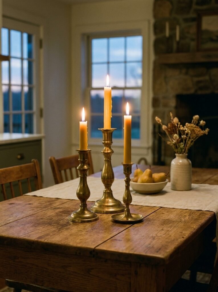
Grouping three candlesticks of varying heights on a kitchen table creates an elegant, low-effort centerpiece that works for both everyday meals and special occasions. The flickering candlelight introduces warmth and softness to the kitchen, particularly during evening meals, while the graduated heights add sculptural interest even when the candles remain unlit.
Choosing candlesticks in a matching metal finish, such as brass, matte black, or antique silver, while allowing slight variation in height and shape, achieves the balanced-yet-dynamic look central to rule-of-three styling. Thin taper candles in neutral tones like white, cream, or soft sage keep the overall look cohesive and unfussy.
This simple centerpiece can be easily adapted for seasonal changes by swapping candle colors or adding small sprigs of greenery around the base. Because the arrangement takes up minimal table space, it works well in both small breakfast nooks and larger dining tables, offering an easy, elegant styling solution.
14. Trio of Copper Pots Hanging
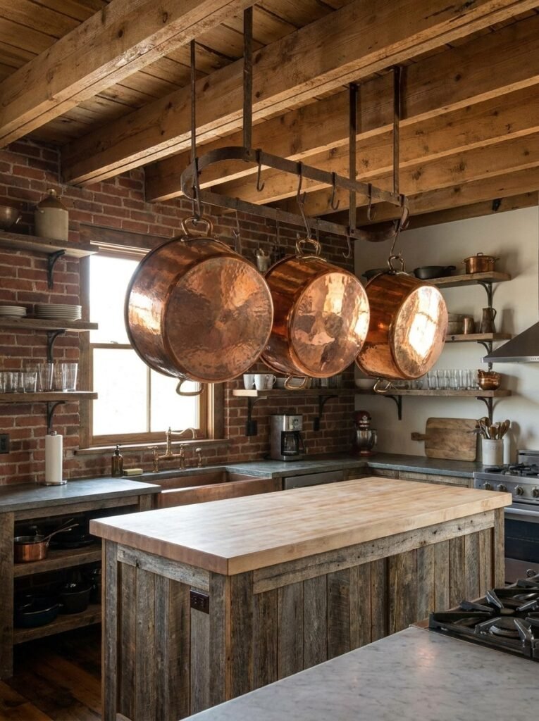
Hanging three copper pots from a ceiling-mounted rack above an island or stove combines practicality with striking visual impact. The warm, reflective quality of copper catches ambient light beautifully, making this display feel luxurious even in a rustic or farmhouse-style kitchen. Suspending the pots also frees up valuable cabinet space below.
Arranging the pots by size, with the largest positioned centrally or at one end, creates a natural visual flow that guides the eye smoothly across the display. Keeping the pots polished enhances their reflective quality, though many homeowners embrace a slightly weathered patina for a more rustic, lived-in aesthetic that still feels intentional.
This hanging display works best in kitchens with sufficient ceiling height and an open layout that allows the pots to be appreciated from multiple angles. Beyond aesthetics, keeping frequently used pots within easy reach improves kitchen workflow, proving that this particular rule-of-three application is as functional as it is beautiful.
15. Three Bottles on a Bar Cart
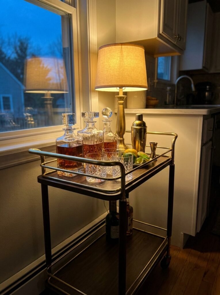
A small bar cart or tray styled with exactly three bottles creates an elegant, curated moment within the kitchen, ideal for those who enjoy entertaining or simply appreciate a stylish display. Limiting the selection to three bottles, rather than a crowded liquor collection, keeps the arrangement feeling sophisticated and intentional rather than cluttered.
Choosing bottles with visually interesting shapes or labels, and varying their heights slightly, creates the graduated silhouette central to good rule-of-three composition. Pairing the bottles with two matching glasses and a small dish for garnishes rounds out the vignette without overcrowding the tray or cart’s surface, maintaining a clean, considered look.
This styling idea works well on a dedicated bar cart, a corner of the kitchen counter, or a floating shelf near the dining area. It signals hospitality and thoughtful design in equal measure, offering guests an inviting visual cue that this kitchen is as much about gathering and entertaining as it is about cooking.
16. Triple Spice Jar Row
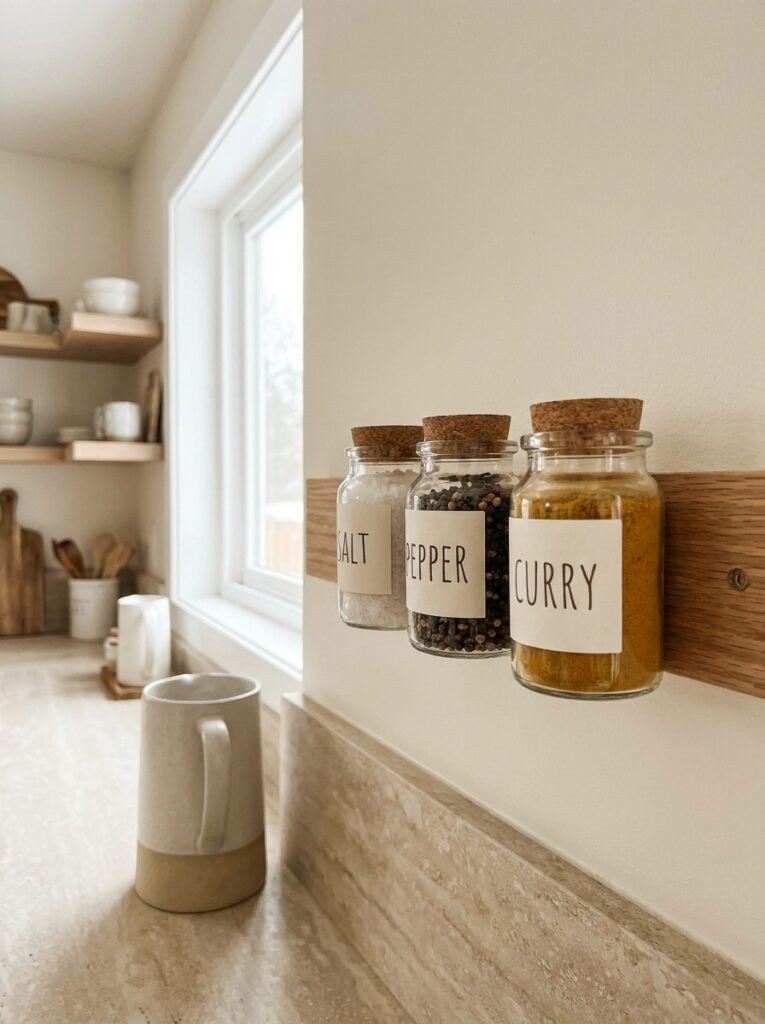
A row of three matching spice jars offers a simple, satisfying way to bring order to kitchen essentials while adding a touch of visual polish. Whether displayed on a magnetic rail, a small shelf, or directly on the counter, uniform jars filled with frequently used spices like salt, pepper, and a favorite blend create instant cohesion.
Choosing jars with a consistent shape, size, and lid style is essential to achieving the clean, intentional look this idea relies on. Simple, minimalist labels in a matching font style reinforce the sense of order, while the natural colors of the spices themselves add subtle variation and visual interest to the display.
This idea works particularly well near the stove, keeping essential seasonings within arm’s reach during cooking. Limiting the display to just three jars, rather than an entire spice collection, keeps the arrangement from feeling cluttered, reserving additional spices for a drawer or cabinet out of sight and preserving the counter’s clean look.
17. Three Decorative Bowls Stacked
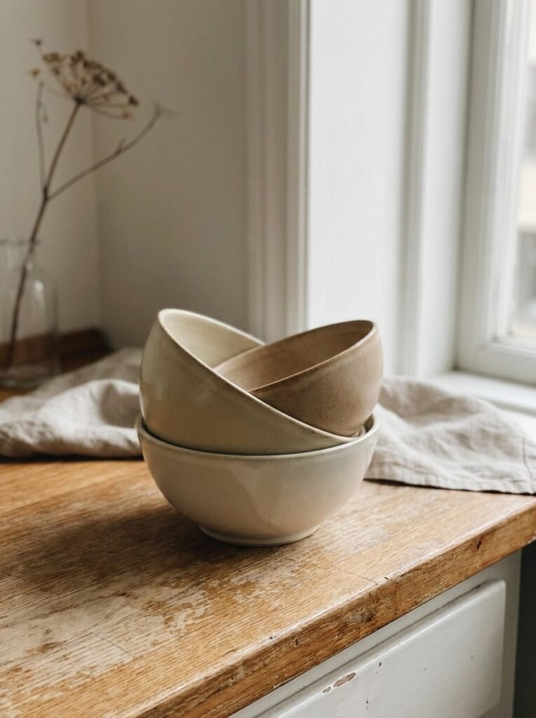
Stacking three ceramic bowls of graduating sizes creates a simple yet visually satisfying sculptural element on any kitchen counter. This display requires no additional accessories or props, relying purely on the bowls’ shapes, colors, and stacked arrangement to create interest, making it one of the easiest rule-of-three ideas to implement immediately.
Selecting bowls in a cohesive color palette, whether matte cream, soft terracotta, or deep charcoal, while varying the size slightly between each, achieves the graduated visual rhythm central to this design principle. Mixing textures, such as one glazed bowl paired with two matte finishes, adds subtle depth without disrupting the overall cohesion.
Beyond their decorative role, these bowls remain fully functional, ready to be used for serving, mixing, or fruit storage whenever needed. This dual-purpose quality makes the display especially practical for smaller kitchens where every object ideally serves both an aesthetic and functional purpose within the limited available space.
18. Trio of Wall Sconces
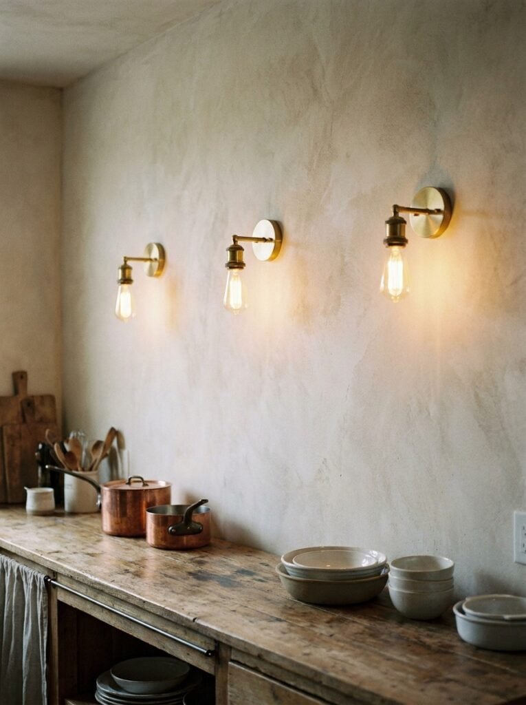
Installing three matching wall sconces along an empty stretch of kitchen wall introduces ambient lighting while doubling as a striking design feature. Unlike a single central light source, this trio creates layered, even illumination across the space, softening shadows and adding a warm, inviting glow, particularly during evening meals or gatherings.
Spacing the sconces evenly, typically aligned with the center of a dining table, island, or workspace below, reinforces the sense of intentional design central to rule-of-three styling. Choosing a finish that complements existing hardware throughout the kitchen, such as matte black or brushed brass, ties the lighting into the broader design scheme.
This lighting choice works particularly well in kitchens lacking natural wall space for shelving or artwork, offering a functional alternative that still contributes meaningfully to the room’s visual interest. Dimmable sconces add further versatility, allowing the ambiance to shift from bright task lighting to soft, relaxed evening mood lighting.
19. Three-Piece Cutting Board Lean on Open Shelf
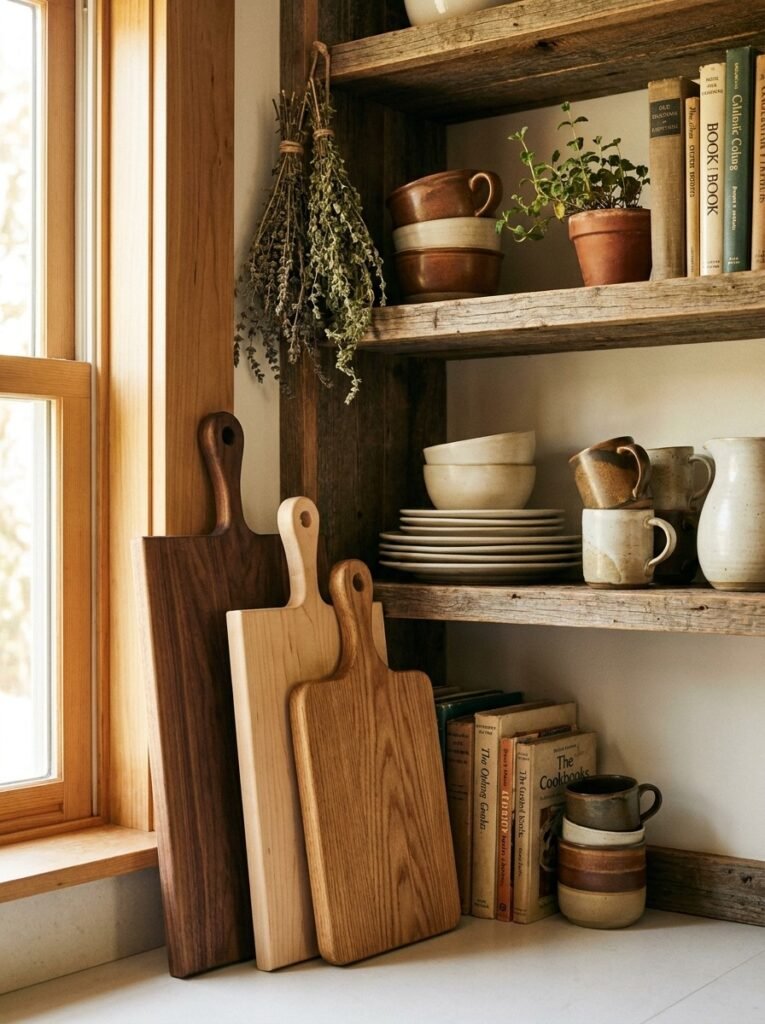
Building on the classic cutting board display, this variation incorporates the boards into a broader open shelf styling moment alongside dishware or cookbooks. Leaning three boards of different wood tones against the back of the shelf creates a textured backdrop, while additional items are layered in front for a fuller, more dimensional display.
The key to this arrangement lies in balancing negative space with layered objects. Positioning the cutting boards toward the back, with a stack of plates or a small plant in front, creates depth without overwhelming the shelf. Keeping the color palette limited to warm woods and neutral ceramics maintains overall visual cohesion.
This styling approach suits open shelving in kitchens that lack upper cabinets, offering both functional storage and an attractive display simultaneously. Rotating the front-facing items occasionally while keeping the cutting board backdrop consistent allows the display to feel fresh over time without requiring a complete restyling of the shelf.
20. Triple Plant Stand Corner
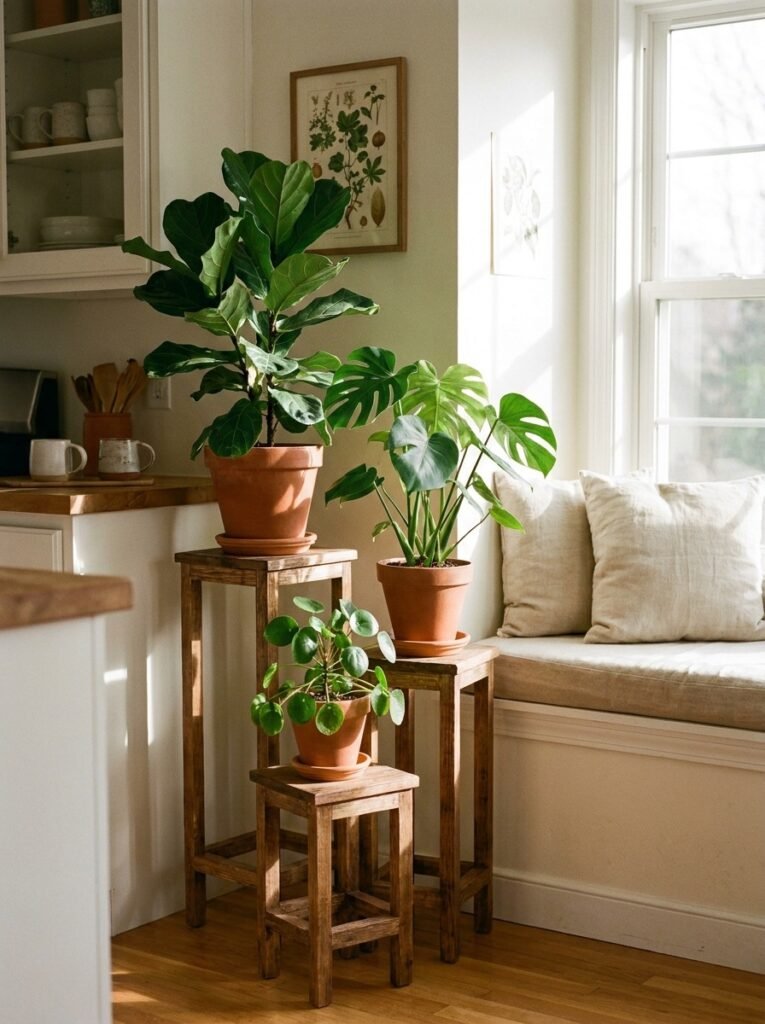
Filling an underused kitchen corner with three potted plants on graduated stands introduces life and softness into a space often dominated by hard surfaces and appliances. Varying the stand heights allows each plant to be seen clearly, creating a lush, layered display that feels more like an indoor garden than a simple corner filler.
Choosing plants with different leaf shapes and textures, such as a trailing pothos, an upright snake plant, and a bushy fern, adds visual variety while the graduated stands provide structural rhythm. Selecting stands in a matching wood tone or finish keeps the display cohesive despite the variation in plant type and height.
This corner display works particularly well near a window where plants can receive adequate light, though low-light varieties allow flexibility in placement throughout the kitchen. Beyond aesthetics, the greenery introduces a sense of calm and freshness, softening the kitchen’s overall atmosphere and balancing out its typically utilitarian design elements.
21. Three Coffee Mugs Displayed
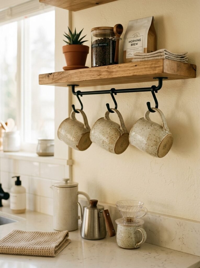
Displaying three matching coffee mugs on hooks beneath an open shelf or cabinet creates a charming, functional vignette perfect for a dedicated coffee station. This small styling choice keeps favorite mugs visible and accessible each morning while adding a cozy, personal touch to what might otherwise be a purely utilitarian corner of the kitchen.
Choosing mugs in a cohesive color palette or matching material, even if their exact shapes vary slightly, achieves the balanced look central to rule-of-three styling. Evenly spacing the hooks beneath the shelf reinforces the sense of intentional design, transforming a simple storage solution into a deliberate and attractive display feature.
Pairing this mug display with a small bag of coffee beans, a French press, or a simple wooden tray nearby completes the coffee station aesthetic. This idea proves that even the smallest, most everyday kitchen items can be styled thoughtfully, adding warmth and personality to frequently used corners of the space.
22. Trio of Cookbooks Stacked
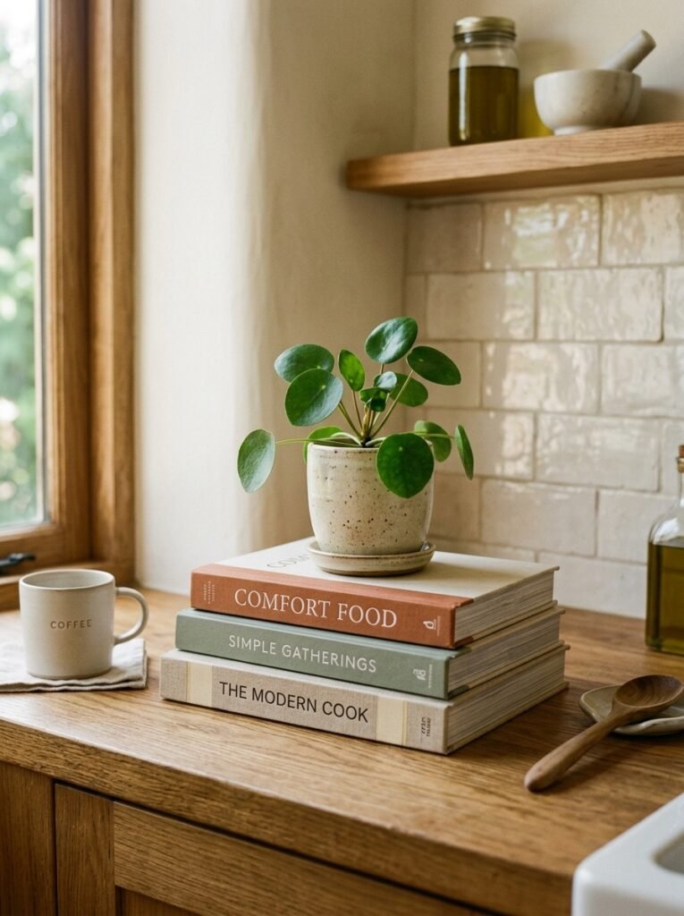
Stacking three cookbooks on a kitchen counter or open shelf creates an easy, personal styling moment that also keeps favorite recipes within reach. Choosing books with varying spine colors or sizes adds subtle visual interest, while the stack itself introduces height and texture into an otherwise flat countertop or shelf arrangement.
Topping the stack with a small object, such as a potted succulent, a candle, or a small ceramic dish, completes the vignette and prevents the books from feeling like an afterthought. This layering technique is a favorite among interior stylists for adding dimension to flat surfaces without requiring significant additional decor investment.
This idea works particularly well in kitchens with a strong personal or collected feel, where books reflect the homeowner’s taste and cooking interests. Rotating the cookbooks based on season or current cooking projects keeps the display feeling relevant and lived-in, rather than a static, purely decorative arrangement that never changes.
23. Three-Drawer Knob Accent Row
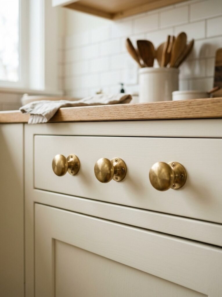
Sometimes the rule of three applies at the smallest scale, such as hardware detailing on cabinetry. Installing three matching drawer knobs or pulls in a row along a bank of drawers creates a subtle but impactful rhythm, drawing attention to often-overlooked hardware details that contribute significantly to the kitchen’s overall design cohesion.
Choosing a hardware finish that complements the kitchen’s broader color scheme, whether warm brass, matte black, or brushed nickel, ensures this small detail ties into the room’s larger design narrative. Evenly spacing the three knobs across adjacent drawers reinforces the clean, intentional symmetry that defines successful rule-of-three application throughout the space.
This detail-oriented approach proves that stylish kitchen design doesn’t always require large statement pieces or bold decor choices. Sometimes, thoughtful repetition in small, functional details, like hardware, creates a polished, cohesive look that elevates the entire kitchen’s aesthetic without demanding significant renovation or investment of time and money.